

You want to add this product to your wishlist ?
Login or create an account
You want to add this product to your wishlist ?
Login or create an account

You want to add this product to your wishlist ?
Login or create an account
You want to add this product to your wishlist ?
Login or create an account
You want to add this product to your wishlist ?
Login or create an account
You want to add this product to your wishlist ?
Login or create an account
You want to add this product to your wishlist ?
Login or create an account
You want to add this product to your wishlist ?
Login or create an account
You want to add this product to your wishlist ?
Login or create an account
You want to add this product to your wishlist ?
Login or create an account


PIERRE FREY


MAGAZINE FREYQUENCE
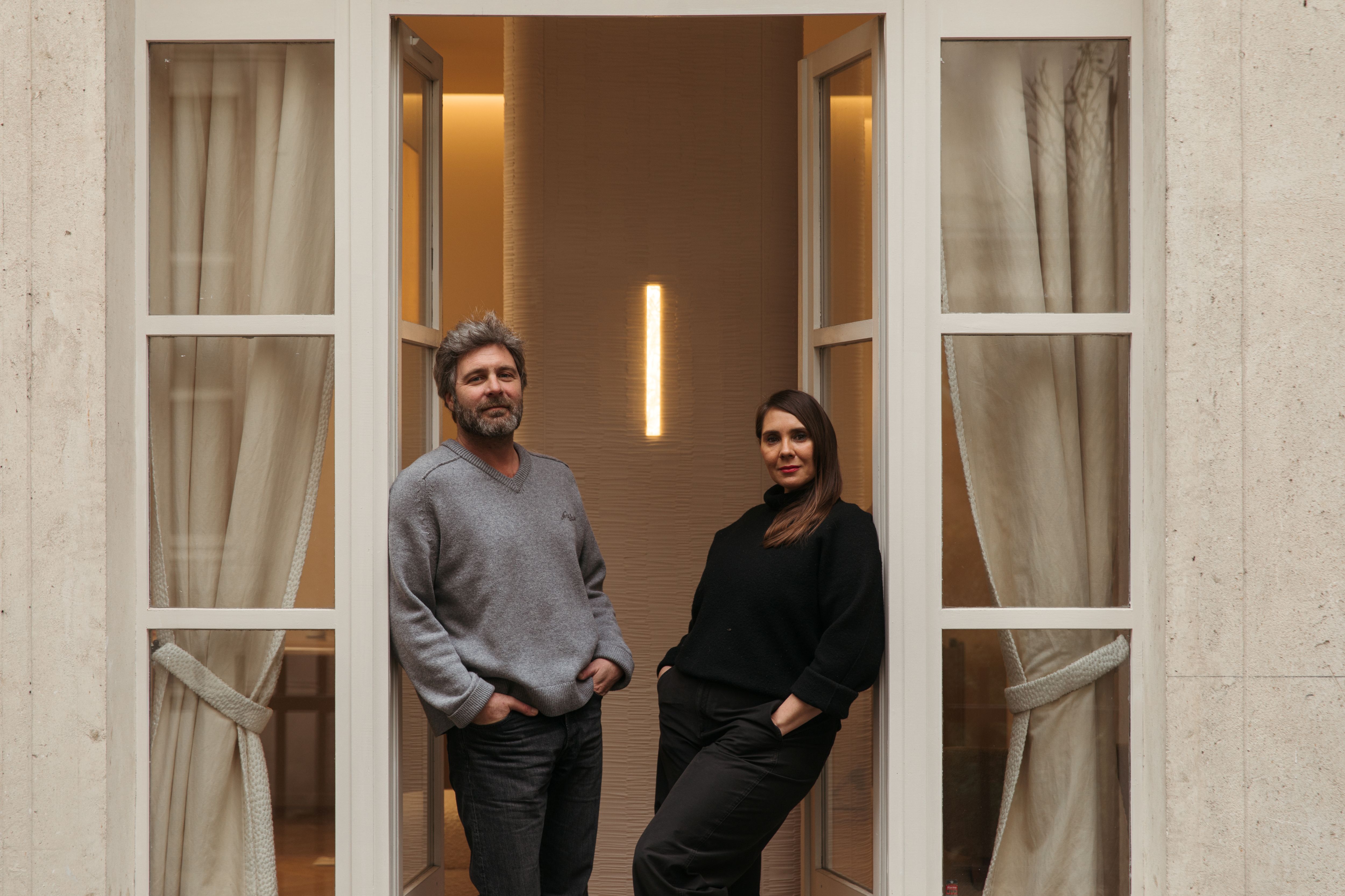
In a light-filled Parisian studio, ideas move like an uninterrupted conversation. At times they contradict one another, brush past each other, refine themselves,
until they find a point of balance. This is how Studioparisien works: through exchange, nuance, and that subtle alchemy that emerges when two perspectives learn to think together.
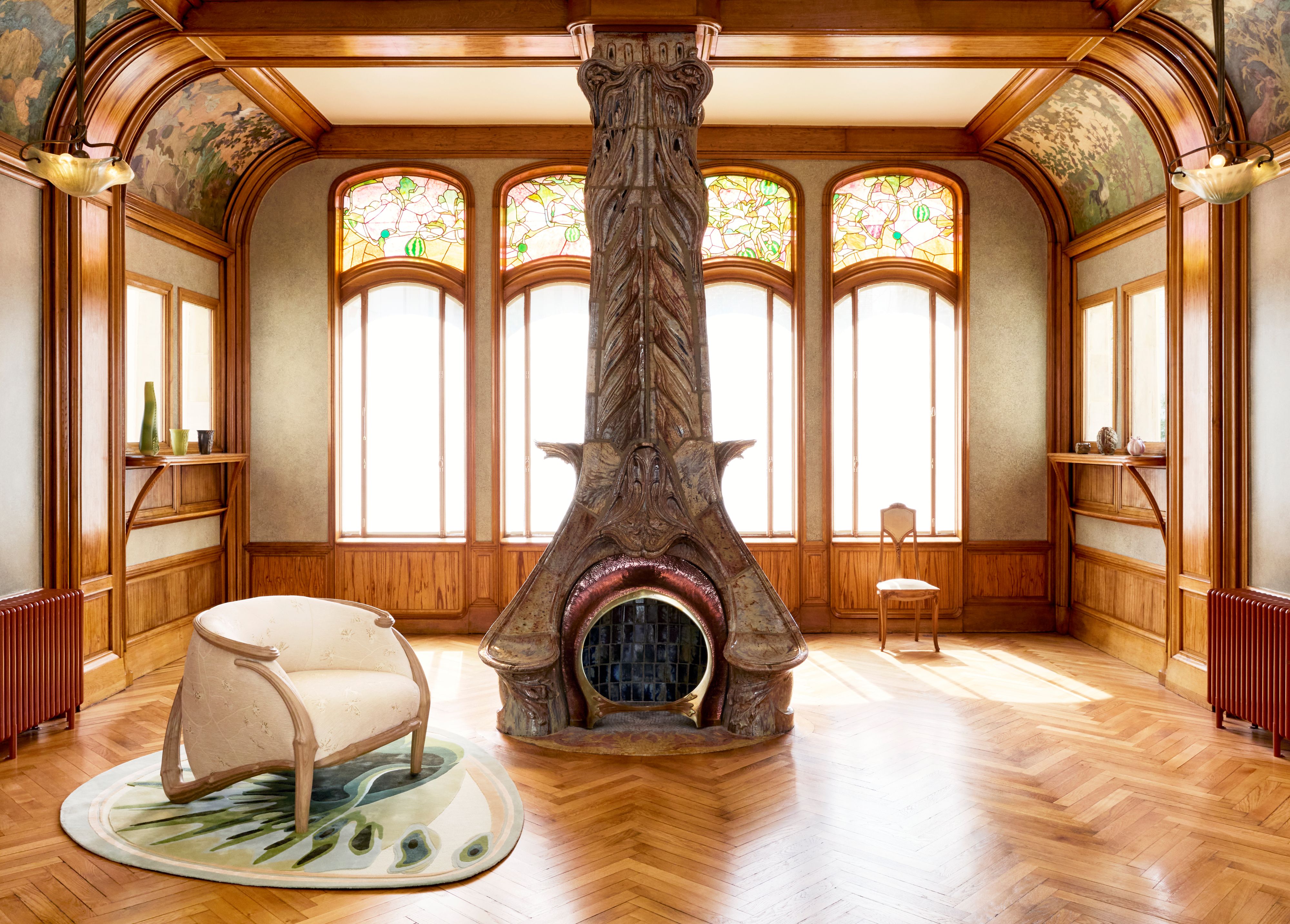
From 6 June 2026 to 3 January 2027, the Villa Majorelle hosts LÀ OÙ LES ARBRES PRENNENT FORM, an exhibition by Hugo Drubay that takes over this emblematic site, the landmark house of Louis Majorelle and a symbol of French Art Nouveau. At the heart of its historical collections, designer Hugo Drubay presents a series of new, previously unseen works that extend this heritage by projecting it into the present day. This project follows an artist residency at the villa as part of Art Nouveau as a New Eutopia, organised by the Réseau Art Nouveau Network. Blending craftsmanship with contemporary technologies, his work sketches a new way of inhabiting space—more organic and directly connected to living systems. Here, Art Nouveau is not revisited; it is set back in motion.
